 Setting column gutter size using column-gap
Whenever columns are create using any of the above column properties, gutters are automatically added in between columns to add that much needed personal space between them. The default gutter width is 1em, which as a reminder translates into 16px in CSS unless the container's font size has been altered. You can modify the gutter width using the column-gap property. Lets say you have a container of 650px and you want to create columns that are exactly 150px in width. To achieve this pixel perfect division, a little math tells us the column-gap value we need:
150 x 4 + (Total column-gap) = 650
Total column-gap works out to be 50, and if we divide that by 3 (since there will be 3 gutters separating the 4 columns), we get a column-gap value of 16.67 (round up). Here's the result:
article.columns{
width: 650px;
-moz-column-width: 150px;
-webkit-column-width: 150px;
column-width: 150px;
-moz-column-gap: 16.67px;
-webkit-column-gap: 16.67px;
column-gap: 16.67px;
}
Output (screenshot):

column-width value of 150px and column-gap of 16.67px inside a 600px container
So a column-gap of 16.67px lets us have columns widths of exactly 150px inside a 650px container. Consider what happens if we increase column-gap by just 1px to 17px- now the Math no longer adds up to 650px exactly: 150 x 4 + (17 x 3) = 651px. In that case something has to give, and that's a column as the browser drops a column and turns the layout into 3 columns instead, with the 3 columns expanding to fill the total space remaining after subtracting the gutters (51px total) from the 650px container. In other words, the column-width value is now treated as the minimum desired width after factoring in the gutters to snugly fit inside the container, and not the actual width you get.
Separating columns in style using column-rule
You can add a vertical rule to visually show the boundaries between the columns using column-rule, which is a shorthand property for column-rule-width, column-rule-style, and column-rule-color. It accepts the same values as the border property to stylize the rule:
article.columns{
-moz-column-count: 3;
-webkit-column-count: 3;
column-count: 3;
-moz-column-rule: 1px solid #c54d1e;
-webkit-column-rule: 1px solid #c54d1e;
column-rule: 1px solid #c54d1e;
}
Column-rule when defined do not take up any physical space within the layout, unlike column-gutter, so their width has no consequence on the width of the columns themselves.
Output (screenshot):

column-rule: 1px solid #c54d1e defined
Changing distribution of content across columns using column-fill
You can change how content is distributed across the columns using column-fill. The default value is balance, which spreads the content evenly across all the columns. This means the height of the columns is automatically set based on this even content distribution.
If you give your columns an explicit height, then for column-fill, another value becomes available, which is auto. With auto the content is distributed sequentially, filling up one column before moving on to the next:
article.columns{
height: 300px;
-moz-column-count: 3;
-webkit-column-count: 3;
column-count: 3;
-moz-column-fill: auto;
-webkit-column-fill: auto;
column-fill: auto;
}
Compare the following two examples, with both having an explicit column height defined, but for the first example, a column-fill set to "auto", and the second, the default setting of "balance":
 column-fill set to "auto" |
 column-fill set to "balance" (default value) |
The value "auto" only takes effect when columns have an explicit height; otherwise, you can expect the "balance" behaviour regardless. **
**Google Chrome (as of v39), seems to set column-fil to "auto" automatically for columns with explicit height defined, which is the opposite of all other browsers. It ignores column-fill: balance even when the value is set as such.
Getting certain content to span all columns using column-span
You can pull select content out of the constraints of the column they're in and have them span across all columns using the column-span property. This is typically done on headers or quotes to draw attention to them and add that stylish touch. Unfortunately Firefox (as of v34) doesn't support column-span yet, though all other major browsers do.
In the following, we've declared two elements within a columns layout -H1 and blockquote- as spanning all columns:
article.columns h1{
-moz-column-span: all;
-webkit-column-span: all;
column-span: all;
color: darkred;
background: #eee;
}
article.columns blockquote{
-moz-column-span: all;
-webkit-column-span: all;
column-span: all;
background: lightyellow;
}
<article class="columns">
<h1>Extra Extra read all about it!</h1>
<p>
The last few years have bared witness not only to major changes in the technologies that power the net, but also the devices that access it. With the myriad of smart phones and tablets of all sorts riding the internet wave, as webmasters, gone are the days where our primary concern is just with the optimal screen resolution to design our sites for. These days there are a lot more variables to content with.
</p>
<blockquote>"Life is like a box of chocolates. You never know what you're going to get."</blockquote>
<p>
The last few years have bared witness not only to major changes in the technologies that power the net, but also the devices that access it. With the myriad of smart phones and tablets of all sorts riding the internet wave, as webmasters, gone are the days where our primary concern is just with the optimal screen resolution to design our sites for. These days there are a lot more variables to content with.
</p>
</article>
Output (screenshot):

3 columns layout with H1 and BLOCKQUOTE set to column-span: all
From the markup, notice how content behaves before and after an element with column-span: all- as separate rows of columns. So the BLOCKQUOTE in this case carves up the content into two independent rows of 3 column content.
Dealing with column breaks with break-before, break-after, and break-inside properties
You can use the break-* properties to deal with when breaks should occur inside your columns (or not), instead of leaving it to chance. Imagine an image with a caption underneath it- having the two elements separated and spanning two columns would cause some serious confusion and fashion malfunction. Currently the break-* properties are only supported in IE10+ (as of January 1st, 2015). Neither Firefox nor Google Chrome supports it. The break-before and break-after properties accept all of the values below, while break-inside only accepts the smaller subset in blue:
| Method | Description |
|---|---|
| auto | The default value, which leaves it to the discretion of the browser whether to break before or following the target element. |
| avoid | Prevent any breaks before or after the target element. |
| left | Force one or two page breaks right before or after the target element so that the next page is formatted as a left page. |
| right | Force one or two page breaks right before or after the target element so that the next page is formatted as a right page. |
| page | Always force one page break right before or after the target element. |
| column | Always force one column break right before or after the target element. |
| avoid-page | Avoid any page break right before or after the target element. |
| avoid-column | Avoid any column break right before or after the target element. |
Currently the break-* properties are only supported in IE10+.
The following example makes use of some of the break-* properties to achieve the following:
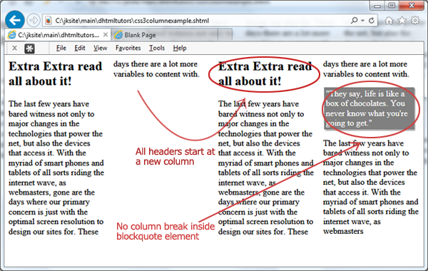
- Headers (H2) always start at the top of a new column using
break-before - No column breaks anywhere inside BLOCKQUOTE elements using
break-inside
Lets see the CSS and HTML markup, then a screenshot of the outcome:
article.columns h2:not(:first-of-type){ /* target all H2 except first H2 element */
-moz-break-before: column;
-webkit-break-before: column;
break-before: column;
}
article.columns blockquote{
-mozbreak-inside: avoid;
-webkit-break-inside: avoid;
break-inside: avoid;
margin-left: 2px;
padding: 3px;
width: 90%;
box-shadow: 2px 2px 3px gray;
color: white;
background: gray;
}
<article class="columns">
<h2>Extra Extra read all about it!</h2>
<p>
The last few years have bared witness not only to major changes in the technologies that power the net, but also the devices that access it. With the myriad of smart phones and tablets of all sorts riding the internet wave, as webmasters, gone are the days where our primary concern is just with the optimal screen resolution to design our sites for. These days there are a lot more variables to content with.
</p>
<blockquote>"They say, life is like a box of chocolates. You never know what you're going to get."</blockquote>
<p>
The last few years have bared witness not only to major changes in the technologies that power the net, but also the devices that access it. With the myriad of smart phones and tablets of all sorts riding the internet wave, as webmasters
</p>
</article>
break-before and break-inside properties at work. Currently supported only in IE10+
Notice how for the H2 selector, we're only targeting elements after the first H2, since we're using break-before: column to insert a column break right before each H2. Doing this for the very first H2 as well would cause the first column to be empty as the first H2 is added to the second column instead.
- Introduction- column-width and column-count properties
- Other column related properties and customizations
- Creating responsive CSS3 multiple column layouts
