Overview of CSS3 multiple column layout
Created: Jan 4, 15'
One of the things that has been difficult to do in web design is showing a continuous piece of content as a series of columns, aka newspaper format. While it's easy enough to use classic techniques such as CSS float to float a bunch of DIVs together to create the columns layout, trying to automatically distribute the content evenly across those columns unearths the challenge. This is where CSS3's multi-column layout comes in real handy- it magically divvies up any piece of content across the desired number of columns, creating that elegant newspaper layout. Here is an example of a CSS3 multiple columns layout:
CSS multi-column layout is supported in IE10+ (full support) and in all modern versions of Firefox and Chrome, on a more limited basis (which I'll clarify later). The purely aesthetical nature of this property plus the decent sized pool of current browsers that support it means there's little reason not to use it today on content that warrant it.
Note that CSS3 multi-column layout shouldn't be confused with multi-column site layout, where the goal is to create an entire site layout using varying column widths to house different parts of a webpage. We'll explore the later using another CSS3 module- CSS3 Flexible Box Layout- to achieve this in an upcoming tutorial.
 Overview of CSS3 Multiple Columns properties
Firstly, lets take a look at all of the CSS3 Multiple Columns related properties and their support:
| Property | Description | Browser support |
|---|---|---|
| column-count | Sets the number of columns the content should be split into. | IE10+ with no prefix, in all other modern browsers, prefix required (-moz- and -webkit-) |
| column-width | Selects the minimum width of each column, with the total number of columns generated based on available container width. | IE10+ with no prefix, in all other modern browsers, prefix required. |
| columns | Shorthand property for setting column-count and column-width | IE10+ with no prefix, in all other modern browsers, prefix required. |
| column-fill | Specifies how content from one column to the next should flow. | IE10+ (no prefix), Firefox 13+ (prefixed), Chrome 4+ (buggy?), Safari 3.1+ (buggy?) |
| column-gap | Sets the gutter space between each column. Takes up physical space within the layout. | IE10+ with no prefix, in all other modern browsers, prefix required. |
| column-rule | Shorthand property for column-rule-width, column-rule-style, and column-rule-color. Defines and styles the column rule to separate each column. |
IE10+ with no prefix, in all other modern browsers, prefix required. |
| column-span | Sets the number of columns an element inside a columns layout should span. | Supported in all modern browsers except Firefox (as of v34). |
In general, when defining CSS3 multiple column properties, we need to define 3 versions at the time of writing- the original property name, plus the -moz- and -webkit- versions. With that said, lets go into it!
The column-count and column-width properties
These are the two main properties you'll use to transform a singular column content into multiple columns- column-count and column-width. They work on any block level elements. So pick your poison and let CSS do the rest. Given the following content:
<article class="columns">
<p>The last few years have bared witness not only to major changes in the technologies that power the net, but also the devices that access it. With the myriad of smart phones and tablets of all sorts riding the internet wave...
</p>
<p>The last few years have bared witness not only to major changes in the technologies that power the net, but also the devices that access it. With the myriad of smart phones and tablets of all sorts riding the internet wave...
</p>
<p>The last few years have bared witness not only to major changes in the technologies that power the net, but also the devices that access it. With the myriad of smart phones and tablets of all sorts riding the internet wave...
</p>
</article>
The following CSS carves it up into 4 columns using the column-count property, with the content distributed evenly:
article.columns{
-moz-column-count: 4;
-webkit-column-count: 4;
column-count: 4;
}
Output (screenshot):

4 column layout on a content. Notice content is distributed evenly across columns
The property column-width works in a similar manner, except it creates columns based on the defined column width value plus the total available width of the parent container and the gutter widths. This means the total generated columns can be unexpected without understanding all the factors involved in the calculation. Consider the following example, which defines a set parent <article> width of 600px plus columns with width 150px each:
article.columns{
width: 600px;
-moz-column-width: 150px;
-webkit-column-width: 150px;
column-width: 150px;
}
At a glance one might expect 4 columns to be generated, since 600 divided by 150 is 4. However, this is the result:
Output (screenshot):
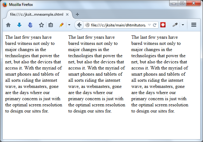
column-width value of 150px inside a 600px container
So what's going on here? Well, as mentioned, besides the total parent container width, there also is the matter of the gutter width between the columns to contend with when you use column-width, which in most browsers by default is 1em (or 16px if the font size of the container is untouched). A parent container of 600px will only adequately contain 3 columns of 150px plus the two gutters between the columns of 1em each (16px * 2), not 4 columns in addition to their gutters. So in actuality, what you get is the following:
Output (screenshot):
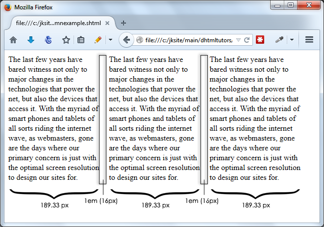
column-width value of 150px inside a 600px container
What's interesting here is that even though we've specified a column-width value of 150px, what actually gets rendered are 189.33px wide columns. The 150px is merely used in the initial calculation of how many columns to fit inside the container, which in this case is 600px wide. Including 1em gutters, that number comes out to 3 (not 4), but at just 150px each, the total width occupied by 3 columns would only be (3x150) + 2em, or 482px, not enough to fill up the entire 600px space. So each column is automatically expanded some more accordingly, deriving at the final column widths:
(600 - (1em x 2)) / 3 = 189.33px
So the takeaway here, the value specified inside column-width is not necessarily the exact width you'll get, but the minimum desired width after including the gutters to snugly fit inside the container.
- Introduction- column-width and column-count properties
- Other column related properties and customizations
- Creating responsive CSS3 multiple column layouts
