 The viewport
 meta tag- the key to preparing a page for mobile devices optimization
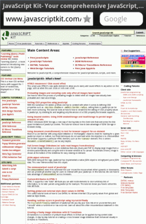
If you test out CSS media queries on a mobile device, you most likely won't see the expected media queries applied initially. There's nothing wrong with your syntax, it's just that your mobile browser thinks it's a desktop browser until someone clues it in. By default mobile devices such as iPhone or Android zoom out on webpages automatically when they are viewed to give the user a more expansive view of the page, meaning everything appears smaller, but also, more pixels are squeezed onto the screen. On iPhone devices, up to 980 pixels of a webpage are shown, and on Android devices, 800 pixels. The benefit of this is that it makes regular, non-mobile optimized webpages appear manageable on this small screen (which is the majority right now), instead of requiring the user to swipe half a mile in which ever direction to view various sections of the page. However, if your page is optimized for mobile devices (via CSS media queries and changing the layout of webpages accordingly), then all of a sudden this "zoom out" behaviour only gets in the way and defeats our efforts. It means that our CSS media queries will match the dimensions of the "zoomed out" device's, and not its actual (ie: 980px for device-width on the iPhone instead of 320px). So whenever you're optimizing a webpage for mobile devices, the first step is to define a particular META tag on your page to alter/ disable the "zoom in" behaviour of mobile browsers, and that's with:
<meta name="viewport" content="width=device-width, initial-scale=1">
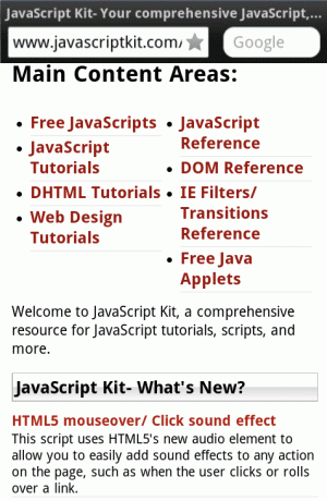
The above, called the viewport meta tag, lets you modify the "virtual viewport" of the mobile device to something different than the default, which is to zoom out on a webpage so its entire contents are visible on the screen. In the above, we're telling the mobile device to display the page without any zooming, so how much the device is able to fit on the screen is what's shown initially. We want this because we'll be using CSS media queries to cater our webpage to the available real estate on different devices, and not the other way around.
 Figure 1: JK homepage with NO "viewport" meta tag. Notice how the mobile browser zooms outs on the page, pretending it's a desktop browser. |
 Figure 2: JK homepage with "viewport" meta tag and its width set to "device-width". No automatic zooming out. |
The viewport meta tag supports a handful of other properties for the "content" attribute:
| Property | Description |
|---|---|
| width | The width of the virtual viewport of the device. Enter a number (pixels assumed), or the keyword "device-width" to set the viewport to the physical width of the device's screen. |
| height | The height of the virtual viewport of the device. Enter a number (pixels assumed), or the keyword "device-height" to set the viewport to the physical height of the device's screen. |
| initial-scale | The initial zoom of the webpage, where a value of 1.0 means no zoom. |
| minimum-scale | The minimum level the user is able to zoom out of a webpage, where a value of 1.0 means the user isn't able to at all. |
| maximum-scale | The maximum level the user is able to zoom in on a webpage, where a value of 1.0 means the user isn't able to at all. |
| user-scalable | Sets whether the user can zoom in and out of a webpage. Set to yes or no. |
When optimizing a webpage for mobile devices, the first step is to add the viewport meta tag to the HEAD section of your page, so that mobile devices refrain from making changes to the zoom level of the webpage unilaterally. In most cases you'll simply want to set the meta tag's content property to "width=device-width", so that no scaling of the page occurs at all, and your CSS media queries will return the actual dimensions of the device, not the "zoomed out" version's. To also prevent the device from zooming in on a webpage when its orientation has been changed from portrait to landscape and visa versa, you can also throw in an initial-scale and maximum-scale property and limit both of them to 1:
<meta name="viewport" content="width=device-width, initial-scale=1, maximum-scale=1">
After that, you can get to work with changing your page's layout depending on the device's dimensions, CSS pixel density, and more. Where to take things is up to you and your design sense!
- Introduction to CSS media queries
- width versus device-width
- The viewport meta tag- the key to preparing a page for mobile devices optimization
- CSS media query matching in JavaScript using window.matchMedia()
CSS media query matching in JavaScript using window.matchMedia() ![]()
