Using CSS3 keyframe animation to create a swinging image
Created: Jan 4th, 15'
In this short tutorial, we'll see how easy it is to create an image that swings like a pendulum continuously using CSS3 keyframes animation. Such an effect has become popular with signage and "discount" images, drawing subtle attention to them. Here's an example:

Image credits: Here
 The CSS and HTML code
The source code is worth a thousand words, so lets first look at the CSS and HTML that comprise the above example before explaining how it all works:
The CSS:
@-webkit-keyframes swinging{
        0%{-webkit-transform: rotate(10deg);}
        50%{-webkit-transform: rotate(-5deg)}
        100%{-webkit-transform: rotate(10deg);}
}

@keyframes swinging{
        0%{transform: rotate(10deg);}
        50%{transform: rotate(-5deg)}
        100%{transform: rotate(10deg);}
}

.swingimage{
        -webkit-transform-origin: 50% 0;
        transform-origin: 50% 0;
        -webkit-animation: swinging 3.5s ease-in-out forwards infinite;
        animation: swinging 3.5s ease-in-out forwards infinite;
}
The HTML:
<img class="swingimage" src="wintersale.png" />
@keyframes rule and animation property syntax
To create the swinging animation, we define a @keyframes rule specifying how our animation should unfold at various points. The syntax for @keyframes is as follows:
@keyframes animation-name{
        keyframes-selector: {css styles}
        keyframes-selector: {css styles}
        "
}
Here's a quick breakdown of the parts that make up this syntax:
| Value | Description |
|---|---|
| anmation-name | An arbitrary string to identify this @keyframes animation |
| keyframes-selector |
A percentage value (0% to 10%) donating the point in the animation the enclosed styles should be applied at.
You can also use the two keywords " from {background: white;}
to {background: black;}
|
| css styles | One or more CSS styles (each separated by a semi colon) specifying the style at this point in the animation. |
Keyframes animations are supported in IE10+, FF5+, Chrome, Opera 12+, and Safari 4+. Within this list, the older versions of Chrome, and Safari require a vendor prefix in front of @keyframes in order to work properly, hence the two versions of the same @keyframes animation definition in our example above (@-webkit-keyframes swinging{} and @keyframes swinging{}).
Note on prefixes: There are other vendor specific prefixes you may need to add in front of your CSS3 rule or property such as keyframes or transition to cover all your bases. The major vendor prefixes are -webkit-, -moz-, -ms-, and -o-. In general however only -webkit- is needed these days to cover Safari browsers still stubbornly hanging on to prefixed versions of CSS3 properties. The important thing is to test your CSS against your target browsers to see if adding a prefix makes a difference. You can use a tool such as autoprefixer to intelligently add vendor prefixes to default CSS3 rules and properties in your CSS.
Once the @keyframes animation has been defined, we use CSS's animation property to reference that animation inside a CSS element or class selector, such as:
.swingimage{
        -webkit-transform-origin: 50% 0; /* for Safari and older Chrome */
        transform-origin: 50% 0;
        -webkit-animation: swinging 3.5s ease-in-out forwards infinite;
        animation: swinging 3.5s ease-in-out forwards infinite;
}
Here we're adding the animation property inside a CSS class (and then assigning the class to the target element). The animation property is shorthand for the following animation related properties:
| property | Description |
|---|---|
| animation-name | The @keyframes animation name to be associated with this animation. Defaults to none. |
| animation-duration | The duration (integer) of the animation suffixed with either "s" or "ms" for seconds or milliseconds. Defaults to 0s, which means the animation won't run. |
| animation-timing-function | Sets the timing function used to animate the @keyframe animation. Valid values include "ease", "ease-in", "linear", steps() etc. Defaults to "ease". |
| animation-delay | The delay (integer) before the animation started, suffixed with either "s" or "ms" for seconds or milliseconds. Defaults to 0s. |
| animation-iteration-count | Sets the number of times the animation should run before stopping. A value of "infinite" means forever. Defaults to 1. |
| animation-direction |
Defines whether the animation should play as normal, in reverse, or alternate between the two. Possible values are:
|
| animation-fill-mode |
Defines how the animation should apply styles to its target when the animation isn't playing anymore. Possible values are:
|
| animation-play-state | Defines whether the animation is initially playing or not. Possible values are "running" or "paused". Defaults to "running". |
Inside the animation shorthand property, if a particular animation property value is omitted, the default value for that property will be used. Furthermore, the order of each property value inside animation in general isn't important, with the exception of the two time related properties (animation-duration and animation-delay)- if both are defined, animation-duration should always proceed animation-delay.
Revisiting the CSS for our swinging image
In our CSS for creating a swinging image, we have the following defined for our "swingimage" class:
.swingimage{
        -webkit-transform-origin: 50% 0;
        transform-origin: 50% 0;
        -webkit-animation: swinging 3.5s ease-in-out forwards infinite;
        animation: swinging 3.5s ease-in-out forwards infinite;
}
Here you can see we've set the animation shorthand property to:
animation: swinging 3.5s ease-in-out forwards infinite;
That is to say, we want the swinging keyframes animation to run for 3.5 seconds for each cycle, using the "ease-in-out" timing function, and for the target element to retain the last keyframe styles afterwards. With the target element keeping the last keyframe's styles at the end of the cycle, we create a seamless transition between the last and first keyframe styles when the next cycle begins. And last by not least, we want this animation to run for an infinite number of cycles.
Now lets turn our attention to the transform-origin property inside the CSS class. It dictates the x-offset and y-offset origin where any CSS related transformation will take place, which in our swinging image will be the rotation of the image. In the demo image above, the "hinge" where the rotation should originate from is exactly midpoint horizontally inside the image, and at the top vertically:
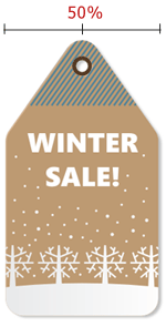
This is why for our transform-origin property value, we have the following:
transform-origin: 50% 0;
Lets consider a different image now with a hinge that's not dead center horizontally:

In this case, we'll want to adjust the transform-origin value to 35% horizontally:
transform-origin: 35% 0;
Demo:

Image credits: Here
The transform-origin property supports either an explicit length value (ie: px) or percentage as its unit, so to be even more precise, you could specify say 77px for the x-offset value instead of 35% here.
The best way to get a handle on keyframe animation and the animation property is to try out different values and see the changes. You can play around with the code for the two swinging images below:
