Setting Flex Items Dimensions and order: flex and order properties
When it comes to size, flex items inside a flex container behave in a "flex box" kind of way that is new in CSS, and hence may be confusing at first. Even with explicit width/height properties defined, the size of flex items "flex" by default, or changes based on the size of its container to take advantage of the available space inside it (or lack of). We can of course change this behaviour, but this is how flex items behave out of the box, and is where a lot of the confusion stems from.
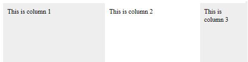
Controlling the size of flex items mainly rests on the flex property, added to each individual flex item. The most common way to this property is to set it to an integer to define the flex item's size as a portion of the total width. Lets say we want to create a 3 columns layout with equal widths; we could do this by adding flex:1 to each flex item:
<!-- HTML: Flex container with 3 columns of equal widths -->
<div class="flexcontainer">

        <div class="columns">This is column 1</div>
        <div class="columns">This is column 2</div>
        <div class="columns">This is column 3</div>

</div>
<!-- CSS -->
div.flexcontainer{
        display: flex;
        min-height: 100vh; /* set min container height to viewport height */
}

div.columns{
        flex: 1;
        padding: 10px;

}

div.columns:nth-of-type(odd){
        background: #eee;
}

Figure 6a: 3 flex items of equal widths using the flex property
Here we are giving each flex item a flex value of 1, which adds up to 3 in total. This means each flex item occupies 1/3 of the total space, making them equal in widths. So we can think of an integer assigned to each flex property as a portion of the total width, with the total width being the values of all of the flex properties added up. The following example changes the previous example so the middle column is twice as wide as the remaining two, by giving it a flex value of 2 while the other flex items gets a value of 1:
<!-- CSS -->
div.flexcontainer{
        display: flex;
        min-height: 100vh; /* set min container height to viewport height */
}

div.columns{
        flex: 1;
        padding: 10px;
}

div.columns:nth-of-type(2){
        flex: 2;
}

div.columns:nth-of-type(odd){
        background: #eee;
}

Figure 6b: 3 flex items with middle column 2x width of the other two using the flex property
In this case we're dividing the total width of the flex container into 4 parts, with the middle column receiving two portions of it while the remaining two columns get 1 portion each. This makes the middle column twice as large as the other two.
-Flex property in more detail and possible values
The flex property is actually a shorthand property for 3 properties: flex-grow, flex-shrink, and flex-basis. While we can declare the later 3 properties individually to control a flex item's size, the W3C specifications encourage us to use the shorthand flex property whenever possible, as it automatically takes care of resetting the values of any of the 3 unused properties to their most common use case. The following table lists the most common accepted values for the flex property, and what it translates to in longhand syntax:
| Flex keyword value | Equivalent to: Flex: <grow> <shrink> <basis> | Description |
|---|---|---|
| flex: initial | flex: 0 1 auto | Flex item is sized based on any declared width/height properties, though is allowed to shrink (up to its minimum content size) if there's insufficient space. |
| flex: auto | flex: 1 1 auto | Flex item is sized based on any declared width/height properties, though is allowed to both grow or shrink in size based on available space within the flex item. |
| flex: none | flex: 0 0 auto | Flex item is sized based on any declared width/height properties and cannot grow or shrink in size. This makes any width/height property inside the flex item behave as they normally do outside the Flex Box universe. |
| flex: Positive Integer | flex: integer 1 0 | Flex item receives the declared portion of free space (integer) relative to the total number of portions of the entire flex container (each participating flex item should have a portion assigned to it). |
We already saw assigning the flex property an integer to size a flex item as a portion of the total width. Another common value is "none" ,which as described above makes the flex item, well, inflexible, allowing any width/height property added inside it to fully control its dimensions. Combining the two ideas, lets change our 3 columns layout to the following dimensions:
- The 1st column is 250px wide and inflexible (doesn't shrink or grow in size ever)
- The 2nd column is 70% of the left over space inside the flex container
- The last column is 30% of the left over space inside the flex container
Flexbox layout with one flex item fixed in size
<!-- CSS -->
div.flexcontainer{
        display: flex;
        min-height: 100vh; /* set min container height to viewport height */
}

div.columns{
        padding: 10px;
        -webkit-box-sizing: border-box;
        -moz-box-sizing: border-box;
        box-sizing: border-box; /* make padding part of width declared, not in addition */
}

div.columns:nth-of-type(1){
        background: #eee;
        flex: none; /* make this flex item inflexible, so width property controls its width entirely */
        width: 250px;
}

div.columns:nth-of-type(2){
        flex: 7;
}

div.columns:nth-of-type(3){
        flex: 3;
        background: #eee;
}
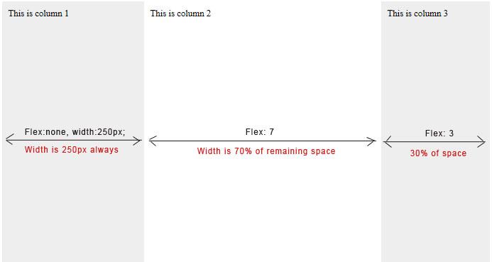
Figure 6c: 3 flex items with column 1 always being 250px wide
The key to making the first column (a flex item) fixed in width that never grows or shrinks is the following CSS:
div.columns:nth-of-type(1){
        flex: none; /* make this flex item inflexible, so width property controls its width entirely */
        width: 250px;
}
We set the flex property to "none" here, which basically makes this flex item inflexible (unable to grow or shrink). Then, any width property we declare becomes the sole determinator of the width of the flex item.
- Alternative way to create a fixed width flex item
Instead of setting flex to "none" and using the "width" property to define a fixed width for a flex item, we can accomplish the same using just the flex property. The key is to use the slightly longer syntax that sets the flex-grow, flex-shrink, and flex-basis properties separately:
div.columns:nth-of-type(1){
        flex: 0 0 250px; /* alternate way to specify a fixed width for a flex item */
}
Here we're tweaking the 3 properties flex-grow, flex-shrink, and flex-basis individually to create that 250px fixed width flex item, by explicitly specifying that the target flex item:
- Shouldn't be allowed to grow based on available size (
flex-grow: 0) - Shouldn't be allowed to shrink based on available size (
flex-shrink: 0) - Finally, should have an initial width of 250px (
flex-basis: 250px)
It's up to you whether to go the route "flex: none" or "flex: 0 0 <value>" to create a fixed width flex item; the end result is essentially the same. The 2nd method, however, is more versatile in that it lets you set a default, explicit width for a flex item yet at the same time optionally make it flex when there is ample space - or lack of space to maintain that fixed width. For example:
div.columns:nth-of-type(1){
        flex: 0 1 250px; /* Specify a fixed width, but allow it to shrink if flex container isn't large enough to accommodate it */
}
 Try it Yourself
Take the flex property out for a spin yourself to better grasp how it works. Launch the flex playground below and change the flex property inside the 3 flex items. Resize your browser to see how the widths grow or shrink (or not) based on the values you've entered:
Changing the display order of flex items: order property
And last but not least, we arrive at the order property. As its name implies, it lets you change the display order of flex items relative to its peers, independent from the items' order in the source code. This means you can order your content physically one way within the source code, yet display them visually using a different order. The order property simply takes an integer as a value (negative) allowed. Added inside the participating flex item(s), the lower the value, the higher up the display order of the flex item relative to other participants.
Lets say we have a <main> element with 3 items inside it- an <article>, a <nav> and an <aside> element. Inside the source, we want the <article> element to appear first to indicate to search engines and screen readers its importance:
<main>
        <article>ARTICLE</article>
        <nav>NAV</nav>
        <aside>ASIDE</aside>
</main>
Having said that, however, we want the actual display order to be different, with the <nav> element coming first, then <article>, and finally <aside>. This can be done simply using the order property:
main{
        display: flex;
}

article{
        order: 2; /* article shows up second */
}

nav{
        order: 1; /* nav shows up first */
}

aside{
        order: 3; /* aside shows up third */
}
Putting it all together- 3 column Flexbox layout
Lets put everything we've learnt in this section together to create a full blown 3 column layout using CSS Flexbox, taking advantage of the flex property to precisely control the flex items' dimensions, and the order property to change their display order:
CSS and HTML:
<!doctype html>
<head>
<style>

main{
        display: flex;
        justify-content: space-between; /* space flex items apart, with no space on left and right edges */
        text-align: center;
        min-height: 100vh; /* set min height to 100% viewport height */
        font-size: 2em;
}

main > *{
        border-radius: 5px;
        background: gray;
        color: white;
}

article{
        flex: 1; /* flexible width */
        margin-right: 10px; /* add right margin */
        order: 2; /* display order */

}

nav{
        flex: 0 1 250px; /* fixed width of 250px, though allowed to shrink if flex container becomes too small */
        margin-right: 10px; /* add right margin */
        order: 1; /* display order */
}

aside{
        flex: 0 1 200px; /* fixed width of 200px, though allowed to shrink if flex container becomes too small */
        order: 3; /* display order */
}

@media screen and (max-width:600px){
        main{
                flex-direction: column;
                min-height: auto;
        }

        main > *{
                flex: none;
                margin: 0;
                margin-bottom: 10px;
        }
}

</style>
</head>

<body>

        <main>
        <article>ARTICLE</article>
        <nav>NAV</nav>
        <aside>ASIDE</aside>
        </main>

</html>
Output:
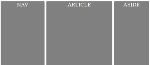
Figure 7: Flexbox 3 column layout. Click to view live example.
Conclusion
In this tutorial we covered the essential parts that make up the CSS Flex Box Module, and how it makes previously hard to construct layouts a walk in the park. As mentioned at the start of the tutorial, once you start flexing, it's hard not to continue doing it!
- CSS Flexbox 101- Introduction and Sample Patterns
- Setting Flex Items Dimensions and order
End of Tutorial
