Creating a slick, animated Full Screen Search Form with CSS3 and JavaScript
Created: Feb 8th, 17'
A well designed and accessible search UI encourages users to interact with your site's search function more frequently, leading to higher user satisfaction and increased page views. To that end, and with the dominance of small screen devices, the trend for search boxes has been to make them extremely large and bold. In this tutorial, we'll go over step by step how to create a slick, well engineered full screen search form that works beautifully across all modern browsers and devices.
Creating the header and search icon interface
To begin, we'll quickly put together a header section using the classic pattern of a logo on the left, and some navigational links plus the search icon on the far right, with everything centered vertically. Eventually clicking on the icon is what will trigger the full screen search box. Instead of using CSS floats, we'll turn to CSS flexbox instead to achieve this layout in a succinct, future proof manner:
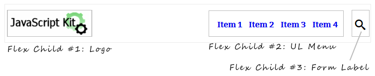
Figure #1: Header with 3 flex items inside it
The HTML:
<header>

        <a id="logo" href="http://javascriptkit.com"><img src="jklogosmall.gif" /></a>

        <ul>
        <li><a href="#">Item 1</a></li>
        <li><a href="#">Item 2</a></li>
        <li><a href="#">Item 3</a></li>
        <li><a href="#">Item 4</a></li>
        </ul>

        <label for="search-terms" id="search-label"><img src="search.png" /></label>

</header>
The CSS:
body{
        padding-top: 70px; // set top padding to house the fixed header
}

header{
        position: fixed;
        width: 100%;
        display: flex;
        top: 0;
        left: 0;
        justify-content: space-between; /* space flex items evenly horizontally */
        align-items: center; /* center flex items vertically */
        background: white;
        padding: 10px 5px;
        font: bold 16px 'Bitter', sans-serif; /* use google font */
}

header, header *,
form#search, form#search *{
        -webkit-box-sizing: border-box;
        -moz-box-sizing: border-box;
        box-sizing: border-box;
}

header ul{
        list-style: none;
        margin: 0;
        padding: 0;
        margin-left: auto; /* right align this flex child */
        margin-right: 10px;
}

header ul li{
        display: inline;
}

header ul li a{
        text-decoration: none;
        padding: 5px;
}

header #search-label{
        cursor: pointer;
        display: flex;
        justify-content: center;
        align-items: center; /* center flex items inside vertically */
        width: 60px;
        height: 40px;
        z-index: 100;
}
The header is set to be fixed in position and display:flex, which turns the 3 children elements inside - the logo, the UL menu, and the search box label - into flex elements, making it effortless to position these elements the way we want to. Specifically, by adding justify-content: space-between to the header, the three child elements are spaced horizontally apart evenly (we tweak the UL menu later to break from this), and with align-items: center, all the child elements are vertically centered inside the header.
Our flex box settings at this point has the 3 header components spaced apart equally on the horizontal axis, though personally I prefer the UL menu to be right aligned next to the search box label. To do this in CSS flex box, we just add margin-left: auto to the menu UL. More details on this technique here.
And finally, for the search box label, or the gateway to our full screen search form, we choose to use a label instead of a regular DIV or span, so when it's clicked on, focus is automatically set on the associated INPUT element. On mobile browsers, this behaviour also automatically triggers the mobile keyboard, which makes for good design. What may not be the best design choice is the use of an image for the "search" icon. When actually deploying you may want to opt for a SVG or icon font that scales without resolution loss, such as one from the excellent IcoMoon.
Creating the Full Screen Search Form
Now it's time for the real fun, creating the search form that's triggered by the search label we defined earlier:
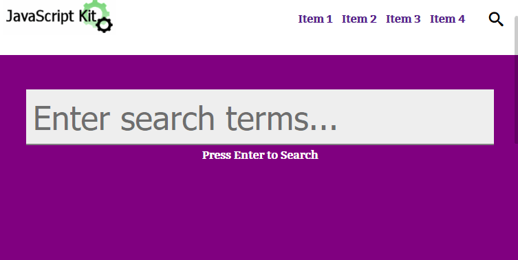
Figure #2: Full Screen Search Form that pops up when "search" label is clicked on
We want the form to appear when the user clicks (or taps in mobile browsers) on the search icon label, and to dismiss it when the user clicks on the label again, or anywhere outside the search field.
Lets see the markup, CSS and JavaScript that makes all this happen:
The HTML:
<div id="searchcontainer">
        <form id="search" action="#" method="post">
        <input type="text" name="search-terms" id="search-terms" placeholder="Enter search terms...">
        <div>Press Enter to Search</div>
        </form>
</div>
For the markup we define a "#searchcontainer" DIV to contain the search form and search INPUT field.
The CSS:
div#searchcontainer{
        position: fixed;
        width: 100%;
        height: 100%;
        z-index: 100;
        display: block;
        background: purple;
        left: -100%; /* initially position search container out of view */
        top: 90px; /* shift container downwards so the header is still visible when search is shown */
        padding-top: 50px;
        opacity: 0;
        cursor: crosshair;
        text-align: center;
        font: bold 16px 'Bitter', sans-serif; /* use google font */
        -webkit-transform: scale(.9) translate3d(-0, -50px, 0);
        transform: scale(.9) translate3d(-0, -50px, 0);
        -webkit-transition: -webkit-transform .5s, opacity .5s, left 0s .5s;
        transition: transform .5s, opacity .5s, left 0s .5s;
}

div#searchcontainer div{
        padding: 5px;
        color: white;
}

div#searchcontainer form{
        opacity: 0;
        -webkit-transform: translate3d(0, 50px, 0);
        transform: translate3d(0, 50px, 0);
        -webkit-transition: all .5s 0s;
        transition: all .5s 0s;
}

div#searchcontainer form input[type="text"]{
        width: 90%;
        top: 0;
        left: 0;
        z-index: 99;
        padding: 10px;
        border: none;
        border-bottom: 2px solid gray;
        outline: none;
        font-size: 3em;
        background: #eee;
}


div#searchcontainer.opensearch{
        left: 0;
        opacity: 1;
        -webkit-transform: scale(1) translate3d(0, 0, 0);
        transform: scale(1) translate3d(0, 0, 0);
        -webkit-transition: -webkit-transform .5s, opacity .5s, left 0s 0s;
        transition: transform .5s, opacity .5s, left 0s 0s;
}

div#searchcontainer.opensearch form{
        opacity: 1;
        -webkit-transform: translate3d(0, 0, 0);
        transform: translate3d(0, 0, 0);
        transition: all .5s .5s;
        transition: all .5s .5s;
}

@media (max-width: 480px){
        div#searchcontainer form input[type="text"]{
        width: 95%;
}
}
Lets break down the important bits in the CSS. For the #searchcontainer DIV, we set it to "position:fixed" with "top:90px" so it doesn't obscure the header element when visible while spanning the rest of the page. And speaking of visibility, the DIV is initially hidden by setting its opacity to 0, but also in addition, its left property to -100%. This ensures that the DIV doesn't overlay (and obstruct) the page when it's not visible on the screen. We didn't opt for using "visibility:hidden", as that prevents any form INPUT inside it from receiving focus, which negates the benefit of using a form LABEL element to trigger the search container's visibility.
To toggle the CSS transitions that reveal and hide the search container and search field, we dynamically add/ remove a CSS class "opensearch" to the #searchcontainer DIV using JavaScript. Inside the "opensearch" class, we define two sets of transitions, one targeting the #searchcontainer DIV, the other the INPUT field inside it. The two are run sequentially, by making use of transition-delay inside the CSS transition shorthand property to stall the later transition. The first transition runs immediately when activated, fading in and shifting downwards slightly into its final resting page the #searchcontainer DIV. Notice the "left" property is set to explicitly not transition and without delay (left 0s 0s), so the container appears in the proper coordinates horizontally immediately when opened. Contrast that with when its time to hide the container, by removing the "opensearch" class from it. The default transition property settings inside #searchcontainer stipulates that the left property in that case should also not transition, but kick in after a delay of ".5s" (left 0s .5s) into the declared value of "-100%", so the other transition properties such as "opacity" and "transform" have time to play out first.
The second transition applies to the form inside #searchcontainer (div#searchcontainer.opensearch form{}), and kicks in after the first to reveal the search INPUT itself.
The JavaScript:
var ismobile = navigator.userAgent.match(/(iPad)|(iPhone)|(iPod)|(android)|(webOS)/i) != null
var touchorclick = (ismobile)? 'touchstart' : 'click'
var searchcontainer = document.getElementById('searchcontainer')
var searchfield = document.getElementById('search-terms')
var searchlabel = document.getElementById('search-label')

searchlabel.addEventListener(touchorclick, function(e){ // when user clicks on search label
        searchcontainer.classList.toggle('opensearch') // add or remove 'opensearch' to searchcontainer
        if (!searchcontainer.classList.contains('opensearch')){ // if hiding searchcontainer
                searchfield.blur() // blur search field
                e.preventDefault() // prevent default label behavior of focusing on search field again
        }
        e.stopPropagation() // stop event from bubbling upwards
}, false)

searchfield.addEventListener(touchorclick, function(e){ // when user clicks on search field
        e.stopPropagation() // stop event from bubbling upwards
}, false)

document.addEventListener(touchorclick, function(e){ // when user clicks anywhere in document
        searchcontainer.classList.remove('opensearch')
        searchfield.blur()
}, false)
And last but certainly not least, we arrive at the JavaScript portion of the script. The first line returns a Boolean indicating whether the User Agent falls into one of the major mobile devices category. We use this Boolean to decide whether to bind to the "click" or "touchstart" event on the various elements. Mobile devices also support "click" any way should our Boolean fail to properly categorize a mobile device in use, though "touchstart" reacts more quickly, without the infamous 300ms delay of "click" on mobile devices.
When the user clicks on the search label inside the header element, we toggle the visibility of the full screen search container by toggling the CSS class "opensearch" on it. If the current action is to close the search container- by checking that the class "opensearch" is missing from the container - we blur the search INPUT field while suppressing the default label action of setting focus on the element from kicking in. The act of setting focus and blurring on a form field has the added advantage of automatically bringing up and dismissing the virtual keyboard on most mobile browsers.
To dismiss the search container when the user clicks anywhere on the document other than on the label or the search field itself, we attach a "click/ touchstart" event to the document element that accomplishes this. Calling e.stopPropagation() inside the search label and field prevents the same action inside these elements from reaching the document.
And finally, our JavaScript makes use of the classList API to handle CSS classes, which is not supported in IE9 or lower. There's a good classList pollyfill if you need legacy browsers support.
