CSS Flexbox 101- Introduction and sample patterns
Updated: Oct 14th, 16'
CSS Flexbox is a layout module for arranging and aligning elements on the page. I'll admit, I'm late to the CSS Flexbox party myself, having finally decided to step into the Flexbox ring just a few weeks ago. There were many reasons that sidelined me for so long- flaky browser support, divergent syntaxes, to just plain old "laziness"; CSS Flexbox to me offered nothing new I thought that existing CSS -albeit sometimes with duck tape and a few screws- can't solve already. After setting aside an afternoon to fully explore the world of CSS Flex Boxes, I return a changed man on the new module and its place in CSS. CSS Flexbox now enjoys excellent browser support, has a unified syntax, and in fact should be learned if you're lazy, as it just makes so many common tasks in CSS that are head shakingly difficult to do, well, easy and intuitive. And what you hear about CSS Flexbox being confusing to grasp- that turned out to be a myth too.
In this tutorial, I'll go over the key elements that make up Flexbox, and also show you some common Flexbox patterns to validate its usefulness. After this leisurely read you'll wonder how you ever went by so long without flexing!
It all starts with display: flex
display: flexThe very first step to triggering the Flexbox layout for an element is by
adding display:flex to it, which turns that element into a
Flexbox container. Lets do just that with the following HEADER element:
<!-- Base HTML -->
<header class="topheader">

	<nav class="left">
		<a href="#">Home</a>
		<a href="#">News</a>
		<a href="#">About</a>
	</nav>

	<form>
		<input type="text" /> <input type="submit" value="Search" />
	</form>

</header>
<!-- CSS -->
.topheader{
	display: flex; /* turn topheader into flex container! */
	background: #E3FFD2;
	padding: 10px 5px;
}

.topheader nav.left a{
	padding: 10px;
	display: inline-block;
}
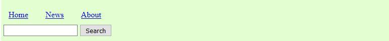
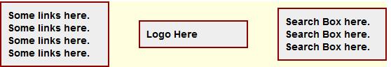
Figure 1.a: Without "display: flex"

Figure 1.b: With "display: flex"
As soon as we add "display:flex" to an element, the
browser's inclination is to try and display all of its children elements
(aka Flex Items) on one line. Our header in this case contains two
flex items- a <nav> element with some links inside, and a
<form> containing a search box. The two screenshots above illustrates
the transformation- by default without using CSS flex box, the two children
elements are displayed stacked (unless we turn to the dark side and float
them, for example), but with "display:flex" added to the
header, these elements appear side by side instead.
When discussing Flexbox, it's helpful to get some key terminology that you'll encounter in the rest of this article out of the way first:
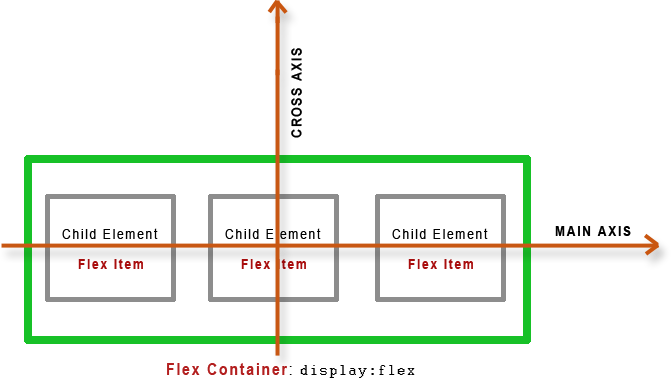
When an element has "display:flex" added to it, that element
becomes a Flex Container. Children elements inside it become flex
items. Finally, flex items inside a flex container can be positioned
along either the main axis (horizontal by default for Western, left
to right languages) or the cross axis (vertical by default for
Western, left to right languages).
Ok, we'll now officially ready to unlock the power of Flex Boxes!
Aligning content on the main axis (ie: horizontally): justify-content
property
So the standard behaviour as soon as we turn an element into a Flex
container (by adding display:flex) to it is to display all of
its flex items (children elements) on one line. From here on, we can align
these flex items in a variety of ways that will alone prove Flex Box's
worthiness. To align flex items along the main axis (horizontal for English
documents by default) inside a Flex Container, we use
the following property inside the Flex Container itself:
justify-content: flex-start (default) | flex-end | center | space-between | space-around
The default value for justify-content is "flex-start",
which causes all the flex items to be aligned at the start of the Flex
Container (Figure 1.b); in a horizontal layout, that means to the very left.
Jumping back to our initial Flex Box example above, lets see how
justify-content can easily left align the child <nav>
element, but right align the <form> so they appear on two ends
of the spectrum inside the Flex container:
<!-- CSS -->
.topheader{
	display: flex;
	justify-content: space-between; /* separate the kids! */
	background: #E3FFD2;
	padding: 10px 5px;
}

.topheader nav.left a{
	padding: 10px;
	display: inline-block;
}

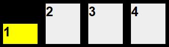
Figure 2.a: Two flex items being pushed apart using
justify-content: space-between
Got your attention perhaps? By merely using CSS Flex Box's
justify-content property and setting it to space-between,
we've created a common header pattern that normally would have necessitated
floating left and right the two children elements, not to mention setting
the parent container's overflow to "hidden" to
avoid content spillage. The "space-between" value basically
causes the container's flex items to be distributed with even space in
between them on the same line, and with no space at either ends of the flex
container. This becomes more apparent if we have more than 2 children
elements. Lets add a 3rd child element to our header- how about a logo
sandwiched between the original two children:
<!-- HTML: Flex container with 3 flex items -->
<header class="topheader">

	<nav class="left">
		<a href="#">Home</a>
		<a href="#">News</a>
		<a href="#">About</a>
	</nav>

	<a href="#"><img src="jklogosmall.gif" /></a>

	<form>
		<input type="text" /> <input type="submit" value="Search" />
	</form>

</header>
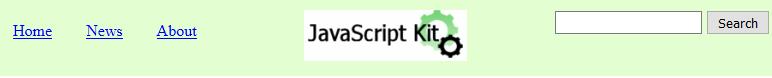
Figure 2.b: Three flex items spaced apart evenly using justify-content:
space-between
Notice the even space between the 3 flex items, with no space at the
start or end of the flex container. And btw, it looks like we've just
inadvertently created another common header pattern- content on the left,
logo in the center, followed by content on the right, using nothing but
-Possible Values
So the justify-content property aligns flex items inside it
on the main axis (horizontal for English documents). The following briefly
describes all the possible values for it:
flex-start: Flex items are aligned at the start of the flex container. Default value.flex-end: Flex items are aligned at the end of the flex container.center: Flex items are aligned at the center of the flex container, flushed. Any left over space is evenly distributed at the beginning and end of the flex container.space-between: Flex items are distributed evenly across the flex container. The first flex item is aligned at the beginning of the container, and the last item at the very end.space-around: Flex items are distributed evenly across the flex container, with the very first and very last flex item also carrying space (1/2 of that of the other flex items) at the beginning and very end of the flex container, respectively.
 Try it Yourself
The best way to understand the difference between the above values is to
actually try them out. Step into the playground below to see how the
different values of justify-content affect a flex container
with 3 flex items inside it:
Playground: "justify-content" property
Aligning flex items on the cross axis (ie: vertically): align-items
property
So far we've learned that a Flex Container by default will try to display
all of its flex items (children elements) on a single line, with the
main axis (ie: horizontal) alignment of the flex items controlled by justify-content.
What about vertical alignment? That's where the align-items
property comes in- it controls the cross axis (vertical in English documents
by default) spacing between flex items on
the same line:
align-items: flex-start | flex-end | center | baseline | stretch (default)
Our menu header example with the logo in the middle looks good already,
but it might look even better if all of the children elements are vertically
centered. This can easily be done by setting align-items to "center":
<!-- CSS -->
.topheader{
	display: flex;
	justify-content: space-between;
	align-items: center; /* center flex items vertically */
	background: #E3FFD2;
	padding: 10px 5px;
}

.topheader nav.left a{
	padding: 10px;
	display: inline-block;
}

Figure 3: Vertically centering flex items on the same line using
align-items: center
This causes the three flex items inside the Flex Container- the <nav>,
logo, and <form> to be centered vertically on the same line.
-Possible Values
As mentioned, the align-items property aligns flex items inside
the flex container along the cross axis (vertical for English documents by
default). The
following briefly describes all the possible values for it:
flex-start: Flex items are aligned at the top of the flex container.flex-end: Flex items are aligned at the bottom of the flex container.center: Flex items are aligned at the center of the flex container.baseline: Aligns the flex items by their respective baselines- usually, this means at the top of the flex container.stretch: Stretches the height of all flex items so they all align vertically. Default value.
The default value is "stretch", which causes flex items with
uneven heights to stretch so they match up with that of the greatest height.
And right there by the way it how Flex Box allows us to easily create
multiple column layouts with equal heights, without doing anything other
than enable Flex Box on the parent container of the columns (display:flex).
Try it Yourself
Click below to see how the align-items property affects a
flex container with 3 flex items of differing heights:
Playground: "align-items" property
Aligning a specific flex item on the cross
axis (ie: vertically): align-self
property
We just saw the align-items property, which aligns flex
items on the same line on the cross axis (ie: vertically). Along the same
lines (no pun intended) is the align-self property, which works
exactly like align-items, though is added inside specific flex
items to affect cross axis alignment for those flex items specifically,
deviating from the setting set by align-items on the parent
flex container.
-Possible Values: Same as those for align-items above
Lets say you use align-items to vertically center 4 flex
items inside a flex container, but for the first flex item, you want to
break away from that setting and align it at the bottom of the line. Simply
add align-self inside the target flex item and set it to "flex-end".
Try it Yourself
Click below to see how the align-self property is used to
set the vertical alignment of a specific flex item to be different from its
peers:
Playground: "align-self" property
Aligning a specific flex item on the
main
axis (ie: horizontally): margin-left and margin-right
property
So for aligning flex elements vertically inside a flex container, we
can use align-items, which affects all of its flex items in
general, or align-self to target specific/ individual flex
items. A natural question to ask at this point is, what about
alignment on the main (ie: horizontal) axis? Does there also exist a "justify-self"
property to accompany justify-content to align specific
elements on the main axis differently from its peers? Surprisingly, there
isn't, though we could use margin-left and margin-right
instead to accomplish the same thing in many respects,
apparently:
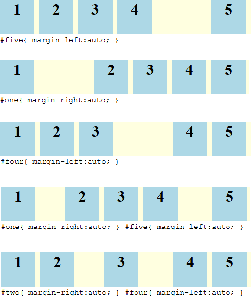
- Add
margin-left: autoinside a specific flex element to right align it and all flex elements that follow it inside the flex container - Add
margin-right: autoinside a specific flex element to left align it and all flex elements that proceed it inside the flex container
Here are some examples of adding margins to specific flex elements inside a flex container to control individual horizontal alignment:
Try it Yourself
Click below to play with the margin-left and
margin-right properties to set the vertical alignment of specific flex item
in a flex container:
Flex Items direction: flex-direction property
flex-direction propertyNear the start of this tutorial, I mentioned that the standard behaviour
of a Flex Container is to display all of its flex items (children elements)
on one line, similar to floating these elements. This is due to the default
setting for the next property I'm about to introduce, flex-direction.
This property controls the flow of the flex items within a flex
container. The default value for flex-direction is "rows",
though with a change to "column", we can position the flex
items as individual columns stacked one against the other instead. Here's
our header example with 3 flex items, but this time, stacked together
instead of side by side:
<!-- CSS -->
.topheader{
	display: flex;
	justify-content: space-between;
	align-items: center;
	flex-direction: column; /* stack the flex items instead of all on same line */
	background: #E3FFD2;
	padding: 10px 5px;
}

.topheader nav.left a{
	padding: 10px;
	display: inline-block;
}
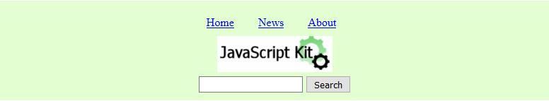
Figure 4: Changing to vertical/column layout using flex-direction: column
The three flex items now appear one below the next, each occupying the entire horizontal space.
Important: When you set the layout of a Flex Container to
vertical (
justify-content and align-items properties reverses as
the main and cross axis inside the flex container are reversed. justify-content now controls the vertical
alignment of the flex items, and align-items the horizontal alignment
(for English based documents).
-Possible Values
flex-direction as mentioned controls the direction of the
flex items within the flex container, whether horizontal ('row')
or vertical ('column'). Here are the possible values:
row: Flex items are positioned horizontally on the same line.row-reverse: Flex items are positioned horizontally on the same line, but with the order of the flex items reversed.column: Flex items are positioned vertically, stacked.column-reverse: Flex items are positioned vertically, stacked, but with the order of the flex items reversed.
Try it Yourself
Launch the flex-direction playground below to experiment
with the different values, and also, to see how the roles of
justify-content and align-items properties in this case
are reversed.
Playground: "flex-direction" property
Specifying Flex Items wrap: flex-wrap property
flex-wrap propertyFlex items within a flex container by default do not wrap- when we resize
the browser, the dimensions of each flex item shrinks as well to try and
stay on the same line. When a flex item can no longer shrink any further (ie:
due to an image with a set width or a long word), it starts to overflow the
container. We can change this behaviour to get flex items to wrap to the
next line instead in this case, by setting flex-wrap to "wrap".
Bringing in our familiar header example again, the original behavior if
we decrease the width of the <header> container is for its
children elements to also decrease in size, for example:
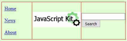
Figure 5a: Original behavior of a flex container with 3 flex items- all 3
items stay on one line regardless of parent container size
The 3 children elements like little duckies stay on the same line
regardless of how small the parent flex container (the links inside the
first flex item may spill over to another line, but the flex item itself
doesn't). By setting flex-wrap to 'wrap', we can
give our duckies permission to break rank and jump to the next line instead
of reducing their intrinsic width/height to fit on the same line:
<!-- CSS -->
.topheader{
	display: flex;
	justify-content: space-between;
	align-items: center;
	flex-wrap: wrap;
	background: #E3FFD2;
	padding: 10px 5px;
}

.topheader nav.left a{
	padding: 10px;
	display: inline-block;
}
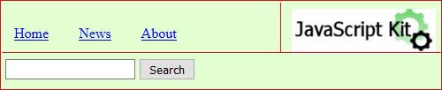
Figure 5b: With flex-wrap: wrap, flex items maintain their
intrinsic widths and spill over to next line if parent container is too
small
-Possible Values
flex-wrap supports the following 3 values:
no-wrap: All flex items inside the flex container are positioned on the same line. Default value.wrap: Flex items wrap if needed to become multi-lined.wrap-reverse: Like 'wrap' above, but flex items wrap up instead of down to the next line.
Try it Yourself
Launch the flex-wrap playground to see the behavior of flex
items based on whether flex-wrap is set to "wrap"
or "nowrap":

Playground: "flex-wrap" property
Aligning multi-lined flex items: align-content property
align-content propertyWhen flex items are allowed to wrap onto multiple lines (using
flex-wrap:wrap), we need another flex property to control the
alignment of these flex items relative to the flex container on the cross
axis (ie: vertically). For that we have align-content. We've
already seen the align-items property, which handles cross axis
alignment of flex items on the same line relative to each other.
align-content
on the other hand does the same for multiple lines of flex items, and
relative to the flex container.
To see the often times subtle difference between align-content
and align-items properties, take a look at the following two
images:
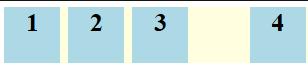
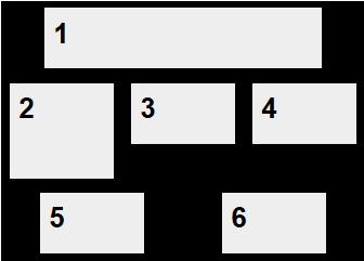 Figure 6a: " align-content:spacearound" ONLY |
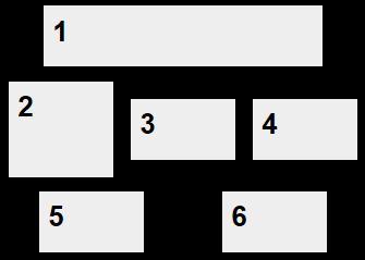 Figure 6b: align-content:spacearound ANDalign-items:center |
Can you spot the difference? The first figure 6a uses only
align-content and set to "space-around" to space
the multi-lined flex items equally in the cross axis (vertically) inside the
flex container. It doesn't affect flex items on the same line in any way,
which is why flex item #2 isn't centered relative to items #3 and #4 on the
same line. In figure 6b, we also add the align-items
property, which deals with alignment of flex items on the same line. By
setting it to "center", flex items #2, #3, and #4 are now also
centered vertically in relationship to each other.
So to recap, align-content is used to align flex items that
are allowed to wrap and span multiple lines relative to the flex container
on the cross axis (ie: vertically). align-items on the other
hand is used for alignment of flex items relative to its peers on the same
line on the cross axis (ie: vertically).
-Possible Values
The align-content property takes on the same values as those
for justify-content, namely:
flex-start: Flex items are aligned at the start of the flex container on the cross axis. Default value.flex-end: Flex items are aligned at the end of the flex container.center: Flex items are aligned at the center of the flex container, flushed. Any left over space is evenly distributed at the beginning and end of the flex container.space-between: Flex items are distributed evenly across the flex container. The first flex item is aligned at the beginning of the container, and the last item at the very end.space-around: Flex items are distributed evenly across the flex container, with the very first and very last flex item also carrying space (1/2 of that of the other flex items) at the beginning and very end of the flex container, respectively.
Try it Yourself
To experiment with the difference between align-content and
align-items yourself, open the align-content
playground below:
Playground: "align-content" property
- CSS Flexbox 101- Introduction and Sample Patterns
- Setting Flex Items Dimensions and order
